TLDR
Nowadays, online ordering pages are an essential part of any successful business. But it's not enough to just have one — you need to make sure it's optimized to drive conversions. That's why we're here to help you get the most out of your ordering page.
We'll show you how to use eye-popping photos, clever copy, and other best practices to create an engaging and compelling experience for your customers. By the end of this article, you'll be able to confidently say that your ordering page is up-to-date and ready for prime time. So let's get started and learn how to trick out your online ordering page!
The Importance of Great Photography on your Website
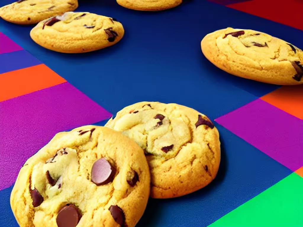
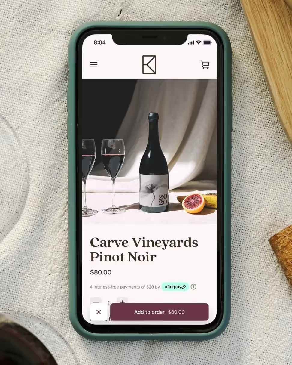
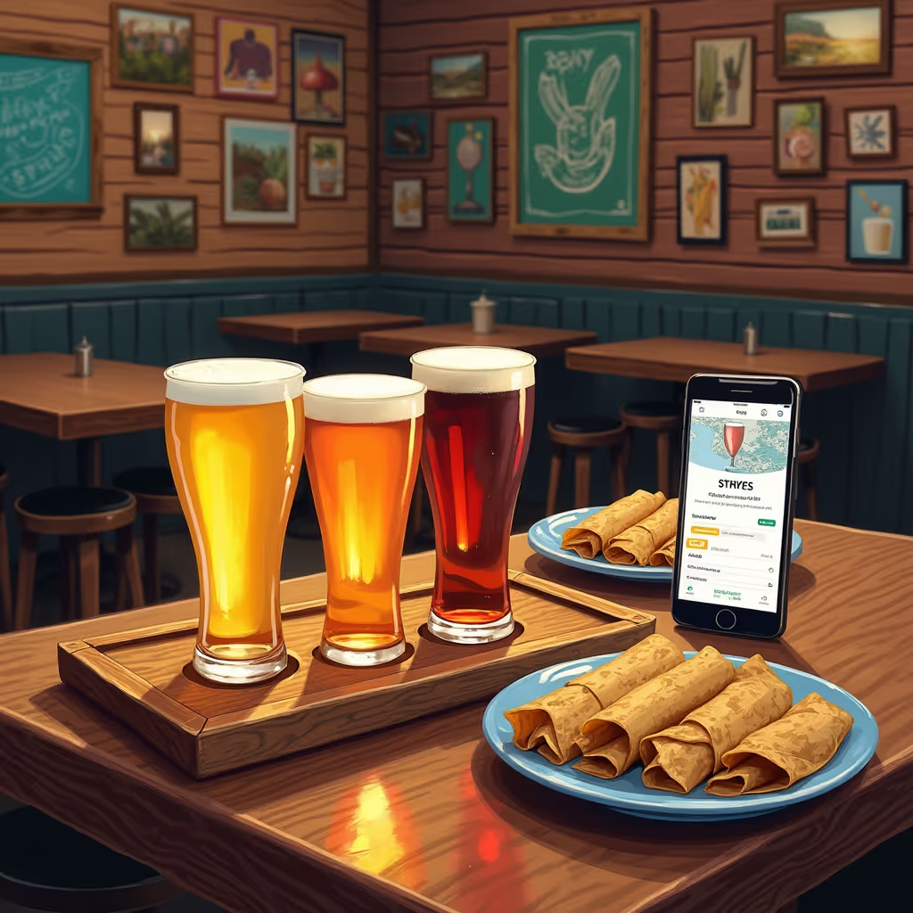
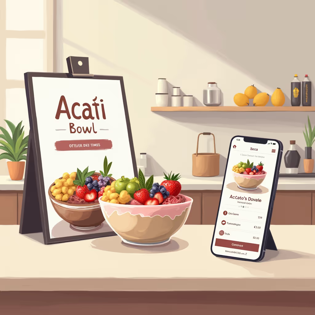
"A picture is worth a thousand words" couldn't be more true when it comes to food photography. It's absolutely essential to have stunning photos on your online ordering page if you want to convert potential customers and get them hitting “Order Now.”
But how can you make your photos really pop? One trick is shooting from a high angle above the subject—your food—to make eyes pop without needing a flash. And don't forget about lighting—it’s essential in making eyes look natural and awake. It can be as simple as using natural light from a window or using light reflectors for more controlled lighting effects.
If you're looking for an even more polished look, editing your feast with Lightroom and Photoshop can create stunning effects, especially when it comes to enhancing the eyes of your subject. This can take your photos from good to great, making them truly unique and eye-catching!
Mouth Watering Descriptions & Calls to Action
Once you've got your menu and pictures placed on the page, it's time to turn your attention to the words. Crafting delicious descriptions of each dish—including more than just the ingredients—will go a long way toward enticing potential customers. Don't forget about a Call-to-Action (CTA) that is included with each dish - it might make all the difference.
Adding words that make people crave your food can help increase conversions on your page. Consider using phrases like "slow-cooked," "hand-made," and "bursting with flavor" to capitalize on food's tastiest characteristics and make sure customers know this isn't a grab-and-go meal. With descriptive titles, you can also set yourself up for increased SEO indexing.
Finally, don't forget to include a CTA! Whatever your unique approach or mission is, make sure to provide customers with a clear path to purchase – whether it’s through “buy now” or “add to cart” buttons, or clickable links with phrases like “order now” or “book now." Showing options upfront can help reduce friction and make ordering easier.
Time-Based Deals & Promotions
One of the key elements in making your online ordering page can convert is to think outside the box when it comes to promotions. In addition to coupons and discounts, you could also consider doing some time-based deals.
Limited-time offers
We all know that urgency is a great tool in sales, so why not leverage it with a limited-time offer? Many restaurants have tried this approach and it works—people feel the need to act fast when presented with an offer that's good only for a short period of time.
Flash Sales
Flash sales are another great way to get people off the fence and into your restaurant. You could offer a meal or other services at a discounted price for a limited amount of time. These types of promotions can help you bring in customers who may otherwise miss out on something special if they weren't able to act quickly enough.
Buy One Get One (BOGO) Offers
People love getting something for nothing, so offering BOGO deals can be a great way to entice new customers or reward existing ones. Buy one entrée and get one free? Yes, please! Just make sure any BOGO offers are for equal value items (dinner entrées perhaps?) and that customers have enough time to redeem them.
Providing Customers With Multiple Payment Options - Apple Pay, Cash App, Etc
You want to make sure your customers have plenty of options when it comes to paying for their online orders. Research has found that customers are more likely to complete their purchase if there's a wide variety of payment methods available.
Think about it:
- If you offer only credit cards as a payment option and your customer doesn't have one, they won't be able purchase your product.
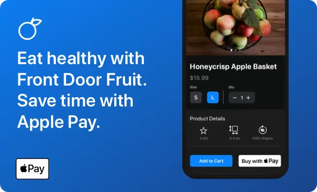
- An alternative payment such as PayPal or Apple Pay could be easier for some, resulting in more conversions for you!
This is why it's important to offer multiple payment methods. According to reports, the most popular payment methods include PayPal (with over 254 million users worldwide), credit/debit cards, ACH Debit, bank transfers, ACH, eChecks, prepaid cards, mobile wallets (like Apple Pay and Cash App), and wire transfers. Providing these different types of payments can help make your customers' buying experience much more convenient and secure—something everyone likes!
Evaluating Your Results & Making Future Changes
It's important to regularly evaluate its performance and make changes if needed. Search engines have added user experience criteria like page loading speed and mobile-friendliness as ranking factors, so you want to make sure your ordering page is optimized for those. Plus, research has found that online food ordering can increase restaurants' revenue and improve capacity management.
To evaluate your online ordering page, assess how it's performing against key metrics like customer satisfaction, number of orders, average order value and sales volume. Once you gather the data, use it to make programmatic changes to improve performance. Make sure elements like text size, call-to-action (CTA) buttons, images and descriptions are optimized for whatever device users are on. As an example, bigger CTA buttons can lead to higher conversions on mobile devices compared to desktops — but only if they're placed correctly!
It's also essential to test any changes you make over time so that you know what works best with your customers. Evaluating your current results and making future changes helps ensure that you get the most out of your online ordering page — so don't forget to do it!
Best Practices for Following Up
When you're trying to convert leads from your online ordering page, staying persistently friendly and nice throughout the process is key. You'll also want to segment your leads based on their interests and how far along they are in their buyer's journey. Then you can use a variety of follow-up methods like drip campaigns, personalized emails, phone calls, or even an in-person meeting with the leads that are further along in the process.
But it's not just about being present—you should be speaking to them on their level and making sure they understand why your product or service is the best fit for them. That takes thoughtful engagement with them as well as lots of small touches that make a customer feel special, such as going out of your way to acknowledge any questions or requests they have.
Here are some best practices for following up with your leads:
- Create automated emails that introduce yourself, explain what you can offer them, and state why you think your product is right for them
- Follow up after initial contact by offering relevant content to nurture leads
- Send personalized emails to engage with customers at each stage of the sales funnel
- Make sure customer service representatives can access all account information necessary so that customers get quick solutions that meet their needs
- Send follow-up emails after purchase to ensure customer satisfaction
Final Thoughts
A well designed online ordering page can make all the difference in increasing sales and customer satisfaction. Through the use of eye popping photos, mouth watering descriptions, time-based deals and promotions, Apple Pay and Square Online, you can create an online ordering page that converts more customers faster. With the right strategies and tools in place, you can ensure your online ordering page is a success!


.webp)


.webp)
.png)
.webp)


.avif)
.webp)
.webp)
.webp)

.webp)




.png)
.png)


.svg)


.svg)
.svg)


.avif)

.avif)
.avif)





.avif)



.avif)
